

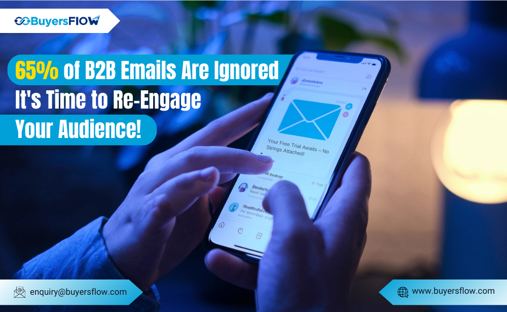
In today’s mobile-first world, crafting emails that render flawlessly and captivate readers on smartphones is no longer a nicety – it’s a necessity. Mobile devices account for a significant portion of email opens, and emails that aren’t optimize for these smaller screens can quickly end up buried or deleted.
So, how do you ensure your emails translate beautifully from desktop to mobile inboxes?
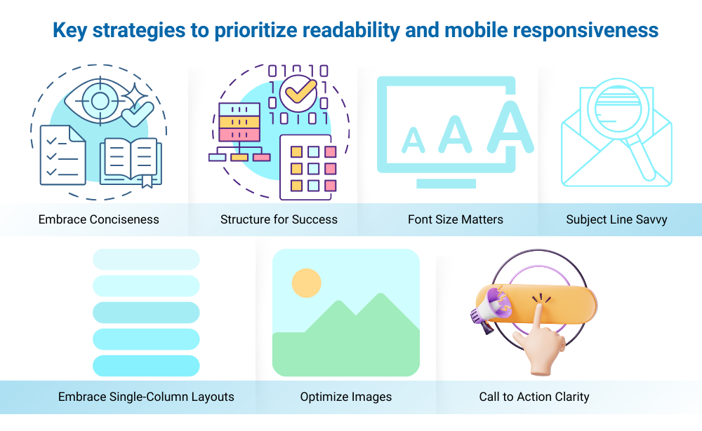
Here are some key strategies to prioritize readability and mobile responsiveness:
- Embrace Conciseness: Keep your email content focused and to the point. Mobile users are more likely to scan quickly, so prioritize clear and concise messaging.
- Subject Line Savvy: Craft compelling subject lines that are short, specific, and pique interest. Avoid going overboard with characters, as they might get cut off on mobile displays.
- Structure for Success: Structure your email with clear headings, bullet points, and short paragraphs to enhance readability on small screens.
- Font Size Matters: Choose a font size that’s easy to read on mobile devices. A general rule of thumb is to use a font size of 14px or larger.
- Embrace Single-Column Layouts: Ditch the fancy multi-column layouts and opt for a single-column design that adapts seamlessly to any screen size.
- Optimize Images: Ensure all images are optimized for mobile viewing. Use clear and concise alt text for each image to enhance accessibility and provide context if images don’t load properly.
- Call to Action Clarity: Make your call to action (CTA) buttons clear, concise, and easy to tap on a mobile device.
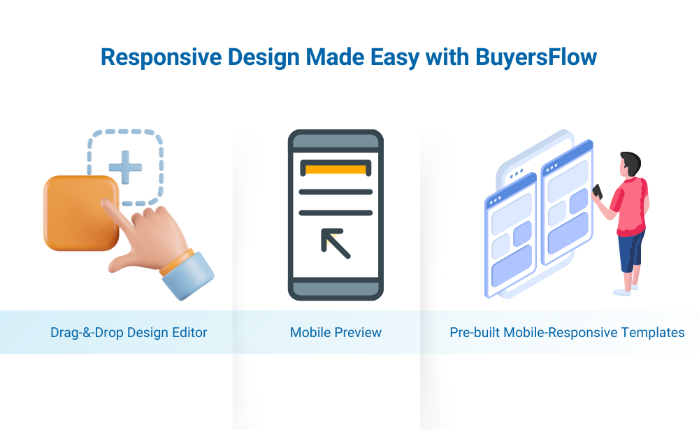
Responsive Design Made Easy with BuyersFlow
Crafting mobile-responsive emails can feel like a technical hurdle. This is where BuyersFlow steps in to simplify the process!
Our platform offers a suite of features designed to make mobile-friendly email creation a breeze:
- Drag-and-Drop Design Editor: Build beautiful and responsive emails with our intuitive drag-and-drop editor, ensuring they render perfectly across all devices.
- Mobile Preview: Instantly preview your emails on different mobile screen sizes to identify and rectify any formatting issues before sending.
- Pre-built Mobile-Responsive Templates: Get a head start with our library of pre-built, mobile-optimized templates that you can customize to suit your brand and campaign goals.
Conclusion:
By prioritizing readability and mobile responsiveness, you can ensure your emails deliver their message effectively, regardless of the device your audience uses. With a focus on clear communication, strategic design choices, and the helping hand of BuyersFlow’s mobile-friendly features, you can craft emails that resonate with your audience and drive engagement, no matter where they check their inboxes.
Ready to design emails that conquer mobile inboxes? Sign up for a free BuyersFlow trial today and experience the power of mobile-optimized email marketing!